Show summary Hide summary
- Why packaging is the new battleground for better-for-you snacks
- How one gluten-free pioneer redesigned its identity for mass appeal
- GoodPop’s strategy: bold graphics and playful flavors for Gen Z
- Clear labeling is becoming nonnegotiable
- Practical packaging tactics that convert shoppers in seconds
- Brand lessons from the freezer aisle
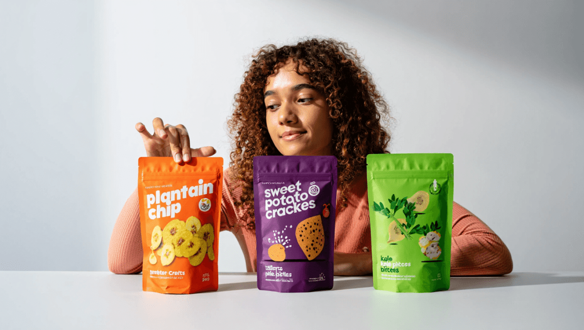
Snack startups that once leaned hard into health claims are rewiring their visuals and messages to win a broader audience. From bold colors to playful product photography, these brands are proving that positioning can nudge shelf placement and shopper choice as much as ingredients do.
Why packaging is the new battleground for better-for-you snacks
As consumer interest in healthier snacks grows, packaging has become a strategic lever. Brands that began with niche labels are now leaning into mainstream cues to attract families and impulse buyers. The goal is no longer just to signal a dietary benefit. It is to convey flavor, convenience, and familiarity—quickly.
Heated rivalry future revealed: gay hockey romance teases second season
Tony Shalhoub avoided Hollywood spotlight: daughter reveals surprising reason
Several forces drive this shift:
- More people seek cleaner ingredients without sacrificing nostalgic taste.
- Retail expansion into mass grocery requires different shelf language than natural channels.
- Regulatory scrutiny and litigation risk favor transparent, specific claims.
How one gluten-free pioneer redesigned its identity for mass appeal
A frozen snack brand that launched over a decade ago as a gluten-free pioneer has updated its look to target mainstream shoppers. The founder, who has celiac disease, originally emphasized gluten-free certification to reassure buyers.
From niche certification to bright, family-focused boxes
The rebrand swapped mostly white packaging for vibrant yellow and modern food photography. Instead of repeating gluten-free claims across every panel, the label now displays certification once up front. The larger design priorities are convenience cues and taste signals.
- Primary callouts: air fryer cooking time, protein per serving.
- Visual changes: bolder colors, appetizing product images, simplified badge placement.
- Target audience shift: families seeking craveable options with better ingredients.
These changes supported fast retail growth. The brand widened distribution into major chains and now appears in tens of thousands of stores. Retail gains were driven by converting shoppers who want quick, familiar snacks with cleaner ingredient lists.
GoodPop’s strategy: bold graphics and playful flavors for Gen Z
Another frozen brand moved away from subtle health messaging toward loud, energetic packaging. The goal was to make products pop inside crowded freezers and appeal to younger buyers looking for novelty.
Flavor innovation meets eye-catching design
New SKUs include unconventional concepts inspired by comfort foods and social trends. One flavor that started as a limited release became permanent after strong demand. Packaging now emphasizes vibrant graphics and flavor cues over lengthy nutritional claims.
- Novel offerings that grabbed attention: a milkshake-inspired French fry pop.
- Recent launches: sour-fruit lines and fruit-plus-cream bars influenced by soda trends.
- Ingredient stance: still using organic or non-GMO ingredients and avoiding artificial dyes.
The company’s leadership argues that health attributes shift on a multi-year cycle. To win repeat buyers, a product must deliver on taste and texture first. Packaging should promise that sensory experience at a glance.
Clear labeling is becoming nonnegotiable
Industry advisors note that both consumers and regulators expect specific, verifiable claims. Vague descriptors like “natural” are losing efficacy. Labels that highlight exact figures or measurable attributes perform better in both marketing and legal terms.
- Shift from broad claims to precise metrics such as grams of protein or “zero sugar.”
- Pressure from class-action suits encourages transparent qualifiers and full disclosures.
- All label information should be readable and unambiguous.
Practical packaging tactics that convert shoppers in seconds
Successful frozen-snack relaunches share a set of design moves aimed at grabbing attention and communicating value fast. Shelf time is short, so clarity matters.
- Use bright, distinctive colors that stand out inside freezer doors.
- Feature appetizing photography to promise taste and texture.
- Prioritize one certification or dietary badge in a visible spot.
- Call out convenience features like air-fryer times or microwave directions.
- Lead with a single, meaningful macro claim—protein, sugar, or fruit content.
Brand lessons from the freezer aisle
Challenger brands aiming to modernize nostalgic categories must balance authenticity and accessibility. Shoppers appreciate cleaner ingredients, but taste remains the top repeat-purchase driver.
- Test bold visual updates in targeted markets before national rollouts.
- Align front-of-pack messaging with the in-box experience.
- Prioritize attributes that matter to the intended shopper segment.
- Monitor legal and regulatory trends to avoid ambiguous claims.